We are pleased to announce our latest improvements to our Cashflow Modeller, including smart interactivity, easy navigation, and more technical analysis. This update contains three key features: Timeline, New Screen Layout & Tax Paid Analysis.
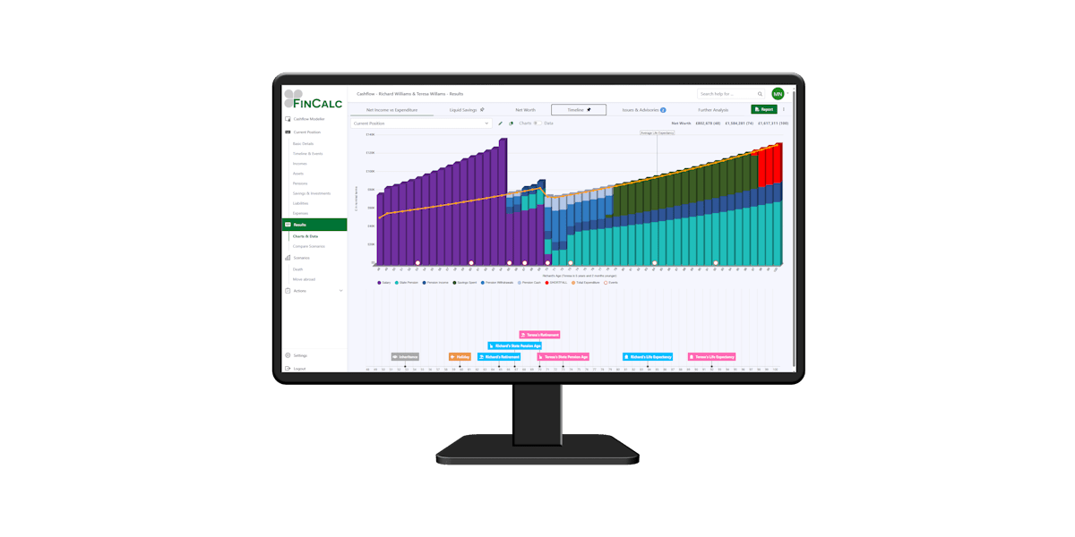
Timeline
Drag and drop events on the results for instant recalculation to illustrate the impact of these changes. This is a powerful tool to use in front of customers to illustrate a number of ‘What ifs’ such as:
- What if I retire at age 62 not 65?
- What if we were to downsize at 75 not 65?
- Illustrate the impact of stress tests or death at varying ages.
Anything that is linked to events can be edited on the results screen.
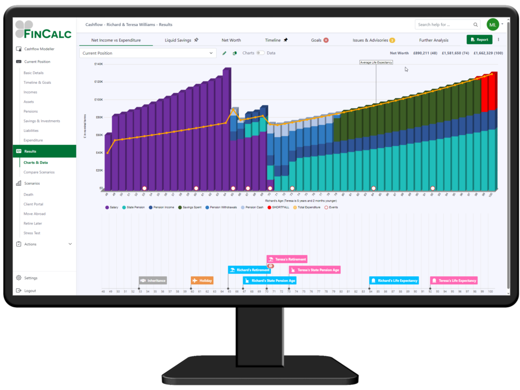
New Results Screen Layout
Use Charts & Data for a full review of a specific scenario, with the ability to pin a second chart to the bottom of the screen if you wish. Interact with the results using the Timeline and take a deeper dive into your clients financials with our new Tax Paid analysis. You are able to switch to data at the click of a button and you are able to select any bar for a full breakdown of the numbers.
Compare Scenarios allow you to review two scenarios on screen and navigate through the charts at the top of the screen. The Net Worth for both scenarios is available throughout and an additional summary of total tax paid is now available.
Tax Paid Analysis
Within the Further Analysis section on the Charts & Data or under the Analysis – Tax Paid on Compare Scenarios you can easily see the Income tax & National Insurance payable for each client year on year through the cashflow, as well as the summary of Total Tax Paid.
This is a great way to show the impact of how pensions are withdrawn or to illustrate the power of tax efficiency from your auto withdrawal strategy.
To find out more, please get in touch.